-

·
Tallo
Lead end-to-end UX design, Facilitate design sprints, Managed and mentor a team of designers, Design System definition and maintenance, Shape user research and testing objectives, Apply data-driven insights to optimize the user journey, Apply new branding throughout the platform
-

·
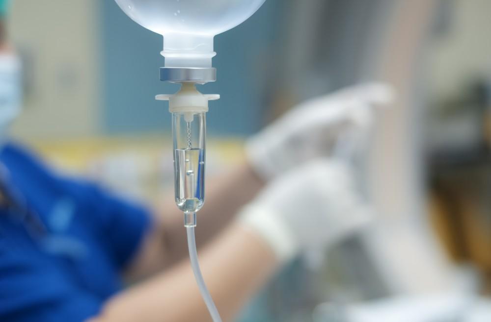
ICU Medical Infusion Pumps
This project required redefining use cases and crafting safe, intuitive touch interactions while balancing a clean interface with stakeholder input, resulting in a compliant, user-centered design that improved safety, usability, and the clinical experience.
-
·
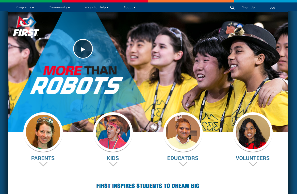
User Onboarding & Dashboards – FIRST®
As Lead UX Designer for FIRST®, I streamlined team management, event scheduling, and volunteer coordination by delivering evaluations, workflows, designs, and testing, improving efficiency and enhancing analytics through stronger data visualization and content strategy.
-
·
Enterprise Medical – DEKA
This project was focused on improving safety of a drug library and how clinical uses for drugs across all levels of a healthcare organization are created, modified, reviewed, and enforced.
-
·
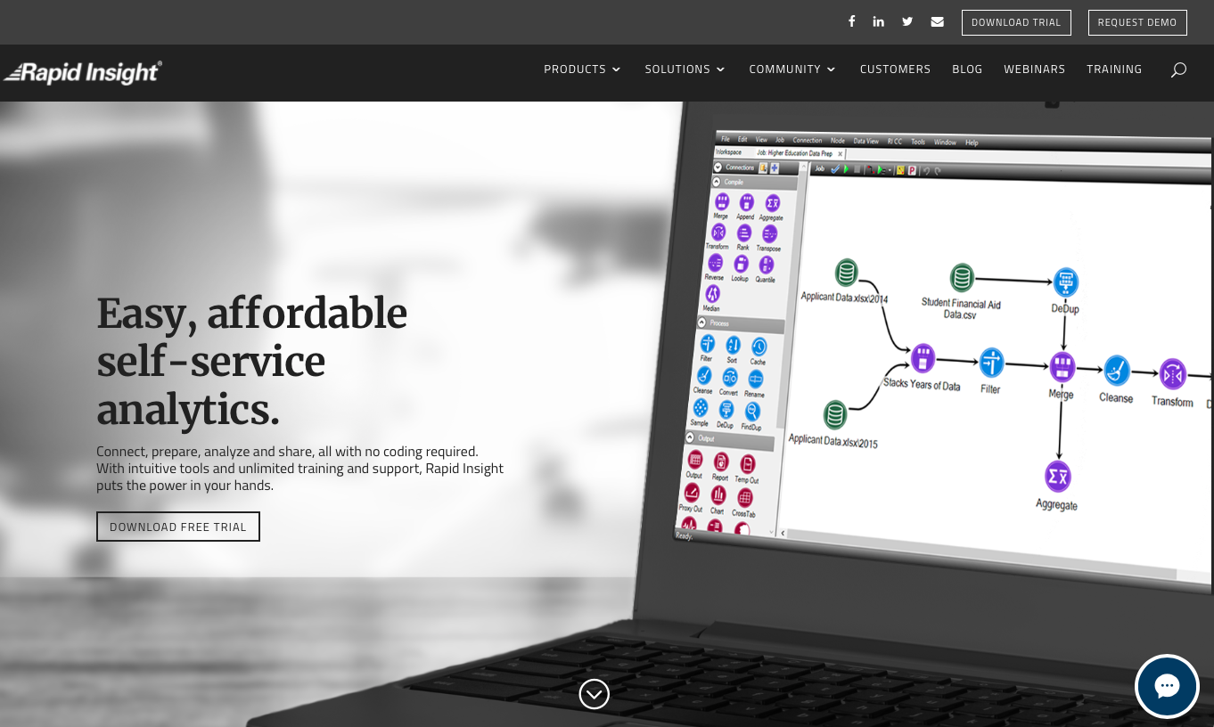
Desktop Data Aggregation – Rapid Insight
Usability evaluation, report of findings with recommendations Update: In October 27, 2021 EAB announced the acquisition of Rapid Insight. The product formerly called “Veera 5” under the Rapid Insight brand has since been branded “Rapid Insight” under EAB. Visit EAB and learn about Rapid Insight About this project Rapid Insight makes powerful and user-friendly solutions…
-
·
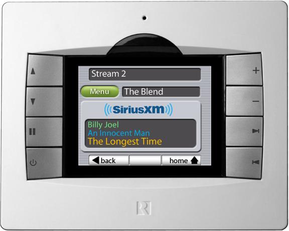
Music System Touchscreen – Russound
Requirements Documentation, User Flows, Prototype, Wireframing About this project The TS3 Touchscreen is an offline user interface for controlling a multiroom audio system. It is mounted in the wall and hardwired to a central control system. Like it’s predecessor, it features a combination of mechanical and software buttons for user input along with visual, tactile…
-
·
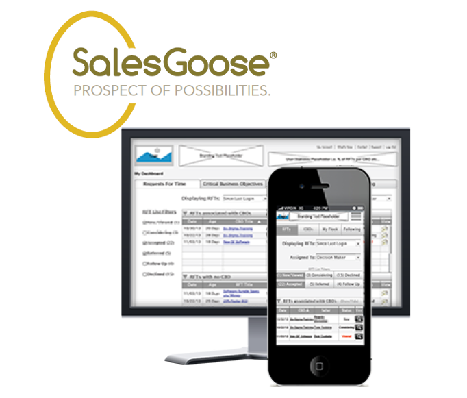
B2B Responsive Web – SalesGoose
Created Task Flows, Sketching, Wireframing About this project SalesGoose is a B2B SaaS product which facilitates sales engagement for effective time management and accelerated decision making. My Involvement I was brought in as a UX consultant to create the interaction design concepts to support mobile and desktop/tablet device users. This required an in depth review…
-
·
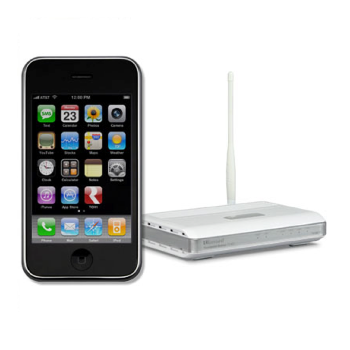
iOS Audio Control – Russound
Created Prototype, Performed Usability Testing, Wireframing About this project Russound’s RNET Touchpoint allows for direct access and remote control of a multiroom audio system from an Apple iPhone™ or iPod touch™. The Touchpoint provides control of any zone in a Russound RNET enabled multiroom audio system along with metadata feedback. My Involvement With the product in…
-
·
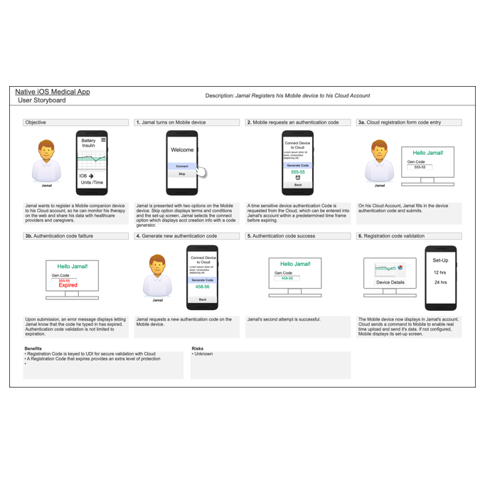
iOS Consumer Health App
Personas, Task Flows, Storyboards, Information Architecture About this project This project targeted end users which needed a native iOS application that managed diabetes insulin therapy being delivered via a wearable device. Funding for this project was placed on hold and I had left the project prior to completion. Content has been altered and client…
You must be logged in to post a comment.