Plum Duo™ Infusion Pump – ICU Medical

About this project

ICU Medical Plum Duo Infusion Pump

ICU Medical is a global leader in IV therapy, offering products and technologies for infusion, oncology, and critical care. Having a major market share in large-volume infusion pumps, ICU wanted to develop a new, flagship device called the Plum Duo™.

This new model would not only double the capacity of their award-winning Plum 360™ pump, it would support many new features with a highlight on safety and efficiency.

My involvement

I worked directly with Sales & Marketing, Product Owners, Safety & Compliance, System Architects along with domestic and international Software Development teams. I would take this project from concept through to market release as the Lead UI/UX designer.

The challenge

I knew that this project wasn’t going to be a simple as putting “two of the current model in the same chassis and add a touch screen”. Incorporating new features would require work to revise existing use case scenarios and create new ones. Plus, moving to a touch-screen interface meant new interaction models would be required. Ones that maintained or increased safety through risk mitigation of possible introduction or increased chance of unintentional user interactions. Making sure to leverage the power of a graphical user interface without unneeded clutter and visual noise would need to be balanced with stakeholders’ visual preference and opinion. There were lots of opportunities for an improved user experience that would bend but not break the status quo and still remain compliant with standards and regulations.

Tools used

Design

Adobe illustrator was used for the visual design of assets. Its ability to export in various formats as well as provide custom naming, supported the development teams’ proposed naming convention.

The main design tool I chose to use as the primary design tool for this project was Axure RP. With the scope of this project and type of deliverables, documentation being a major one, Axure RP was a perfect match. I find it surpasses other tools in reporting capabilities and while prototypes may not look as slick or flashy as some other tools out there, Axure RP is more than capable. Data driven variables, gesture input, conditional logic, you name it – this tool delivers and the ability to run prototypes offline or through a web browser came in real handy during usability testing.

Accessibility

In addition to HE75, accessibility was addressed using WebAIM for contrast to pass WCAG AA requirements and the ‘Let’s get color blind’ Chrome extension was used to simulate multiple 3 forms of color blindness: Deuteranomaly (green), Protanomaly (red), and Tritanomaly (blue). The simulated output colors were also run through WebAIM’s contrast checker to be sure that they still passed.

Facilitation

In addition to Axure’s cloud based platform, the handoff of all artifacts was facilitated through Github. Using a repository structure defined with development team input, each repository was based on a product, its deliverable type, and release version.

Deliverables

Task Flow Diagrams

Existing functionality and use cases were validated for reuse in the new platform then reviewed in depth to understand workflows and hierarchy. New features were organized under appropriate use case(s) and incorporated into new or existing workflows. With system level and atomic requirements applied, creation of task flow diagrams began ranging from complex tasks to scalable navigation models. Each mapping out all input options and related conditional logic for system response including error handling. After iterative review / design cycles, diagrams were finalized. The flows were not only foundational for chunking out content for preliminary UI layouts patterns, but helped software development teams with coding system level logic and state machines.

User Interface Layout

Following the ANSI/AAMI HE75 standard, touch-target and typography sizing was derived based off of the display’s PPI so that they would render at desired physical

dimensions for proper interaction and readability. Using those as base-level constraints, I then calculated a grid for the UI components to adhere to. Late stage feature additions and/or revisions to requirements sometimes could not adhere to the grid, but the best effort was made to find an acceptable balance between change requests, UI constraints, and UX outcomes.

Concepts

Once the content areas were defined, effort was placed on creating the UI content itself. Various concepts were created, evaluated and iterated upon to arrive at the final design. Throughout the process, design evolution reflected the changes in content prioritization, feature additions and changes, and changes in stakeholder visual preferences. Many concepts were prototyped to interactively demonstrate interaction models and system visual feedback.

Wireframes

Once concepts were approved, they were brought down to a low-fidelity, gray-scale variant that sanitized them of color, text values and other conditional attributes. This allowed the wireframes’ UI images to scale over time without requiring updates if a color or label changed.

The design leveraged common components, sometimes called ‘masters’, for reuse and consistency in the design. This permitted global behavior to be defined at that level and any instance of a common component would possibly include instance-specific behavior in addition.

All attributes were annotated using footnote ID numbers that corresponded to callouts on the UI image. The annotations were broken up into separate tables: General Description, Visual Design, and Typography.

Initial wireframes also defined valid & default values, conditional logic states, and more. Essentially, the ‘when’ and ‘why’. However, a single source of truth for developers was needed and those details were moved out of wireframes to system-level requirements. This made iterative changes easier to maintain for the project.

Interactive Prototype

Interactive prototypes were created for multiple reasons. First, as a tool to help convey concept design intent for a shared understanding and informed decision making. Secondly as another tool that product owners and content creators could use to test text strings and labels for proper fit while maintaining compliant size for desired distance readability. And lastly, based of wireframes for usability testing. These prototypes were very functional but dynamically populated values, conditions, and limitations sourced from data tables based on cumulative decisions made by the user.

Usability Testing

I helped create the protocol and moderator guide for several rounds of testing. As an observer of the testing, I captured my observations and helped determine the cause of any usability issues revealed as well as provide insight as to various methods that could be employed to resolve them.


Enterprise Medical – DEKA

Task-flow, Sketching, Asset Library, Wireframing, Prototyping

About this project

One of the greatest risks to Patient safety in drug delivery is human error. Doses must be calculated using a myriad of variables and a decimal point can be the difference between life and death. This project was focussed on improving safety  through managing the drug and it’s clinical uses across all levels of a healthcare organization. From pharmacist to clinician, the drug is controlled by an intelligent software that provides faster, safer delivery of drugs from a drug library to the infusion pump. Due to the confidentiality of this project, deliverables and product images are not able to be shown.

My Involvement

I was brought in as a lead designer and to lead a team in the design of desktop software that would support safety critical decision across multiple users and use cases. I worked with three different development teams that encompassed both the desktop software as well as hardware components related to the delivery of drugs. I met with subject matter experts in key roles of leading pharmaceutical companies to facilitate requirements gathering as well as review designs in various stages.  

Task-flow creation and analysis

Working closely with Product Managers, I distilled hundreds of individual requirements and their dependencies into task-flow diagrams. This visually mapped the logic in each use case and revealed conditions, dependencies and errors that were incorporated into requirement revisions. Once this was resolved, it paved the way for a faster design approach that would be able to satisfy safety needs as well as desired functionality. With annotated references to supporting requirements, these artifacts were a critical part of the traceability of design considerations for internal and federal review.

Wireframes

Asset Library

Using the task-flow diagrams, design work on the interface could begin. First on the list was to create a custom asset library of widgets. Each was documented with it’s own native styling and behavior then grouped into classes. This provided a key foundation for consistency and reuse throughout designs and development teams would benefit by limiting on-off widget coding. 

Typography

Typography and a Style Guide were defined for all widgets and text elements as this project would be heavily using forms. Safety aspects along with conditional dependencies imposed constraints on the layout of content. For that reason, the typography was handled up front so that we could design to scale. And as with the widget library itself, consistency and reuse were other key factors driving this effort.

Wireframes

Now that the base elements for UI design had been created, wireframing ensued. Key subsystems of the main application were each geared towards specific users and their tasks. As such, I took the approach to align individuals, including myself, with each subsystem. In addition, I managed the design and review process. We started off sketching designs to quickly iterate on concepts and refine the needs for the interface and a content strategy.

Using the team edition of Axure, we were able to check out / in our respective work into a SVN repository that would allow efficient and visible work. Custom report templates were created in Axure to allow us to quickly generate output documentation on a moments notice for key stakeholders which was also managed under version control. The documentation included the details for interactive behavior beyond what was native to the respective widget as well as the styling applied as defined in the style guide. 

Prototype Creation

Due to the complexity of conditional behavior and dependencies, it was decided that prototyping would be based off a duplicate of the wireframe pages. This allowed us to impose whatever means necessary to render the interactive behavior desired without tainting the integrity of the wireframes themselves. By using an interactive prototype, we were able to iterate through the review process faster with both internal and external stakeholders. The prototypes were eventually used in usability testing by a dedicated Human Factors team and allowed data to be collected without imposing on development teams progress on approved UI designs.

iOS Consumer Health App

Personas, Task Flows, Storyboards, Information Architecture


About this project

This project targeted end users which needed a native iOS application that managed diabetes insulin therapy being delivered via a wearable device. Funding for this project was placed on hold and I had left the project prior to completion. Content has been altered and client references have been sanitized from samples to maintain anonymity.

My Involvement

My role in this project was as a contributing leader for the development of deliverables and to facilitate communication and design reviews with key stakeholders including Product Management and Executive level.

Persona Creation

Personas were created to help use case development to empathize with and understand specific user types’ needs and pain points. Project constraints pre-determined that personas could only be based on a combination of resident Subject Matter Expert(s)’ personal experience and second hand knowledge conveyed by user advocate individuals. As such, these personas would be limited in their ability to validate design goal achievement without user research to back them up.


Task flow creation

Task flows are always helpful with working on safety critical projects. By mapping out the use case logic as defined in requirements they helped facilitate a closer relationship with product owner. They also created the opportunity for improvement of the requirements by streamlining use cases and eliminating wasteful loops and dead ends in the flow.

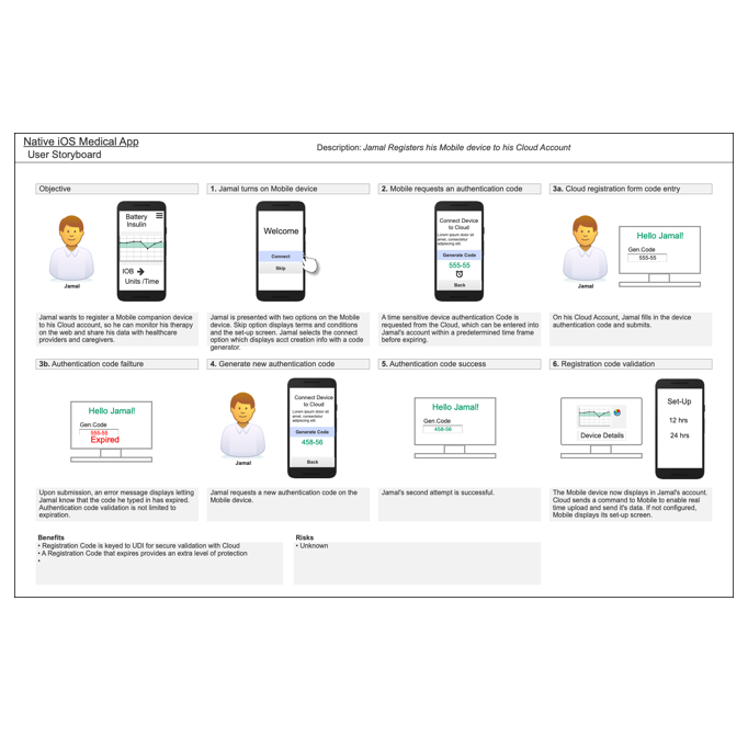
Story board creation

After reviewing the site, it was necessary to reevaluate the workflows for various key tasks. This was done thr


Information Architecture

Using the task flow diagrams, we could frame the hierarchy for the information architecture. This would become foundational in determination of optimum navigation methods. It would also help identify areas where content could be best split across multiple views on a mobile device with a limited display size.