
Overview
ICU Medical, a global leader in IV therapy, set out to expand on the success of its award-winning Plum 360™ infusion pump. They required UX and UI design for what would become the new Plum Duo™, a dual-channel system featuring a full-color touchscreen and enhanced safety and efficiency features. Following strong test market results of the Plum Duo, ICU also initiated development of a single-channel version called the Plum Solo™.
Project Summary

Role
Lead UX Designer

Responsibilities
UX & UI Design, Client Management, Usability Testing coordination

Collaborators
R&D, Marketing, Sales, Product Owners, System Architects, Software Engineering & Development (domestic & international teams), Compliance, Legal

Deliverables
Task Flow Diagrams, Design System, Annotated wireframes, Interactive Prototype

Outcome
Patented medical device that passed 510K while improving IV therapy efficacy, safety, and simplicity
The Challenge
The goal was to respect market acceptance of legacy products, enhance the user experience for new and existing features to grow existing market share while maintaining compliance with industry standards and regulations at a global scale.
This project involved far more than putting two infusion pumps in the same chassis. Swapping out hard buttons and a dot matrix display for capacitive touchscreen were literally surface level changes. Incorporating a suite of new performance and safety features required review, revision, and creation of use cases, designing new touch and gesture based interaction models that were efficient while maintaining compliance with ANSI/AAMI HE75 and IEC 62366 standards for safety and human factors. Working with a dispersed team required a high degree of clarity and structure in order to dynamically incorporate evolving stakeholder preferences and testing feedback without major disruption to the design.

Approach
Tools Used
Adobe Illustrator
Visual Design asset creation and custom naming for unique identity across design and development repositories
Axure RP
Task flow diagrams, low / high fidelity wireframes, custom reporting, interactive prototypes with data driven variables, conditional logic and gesture input
WebAIM
Contrast checking tools for HE75 and WCAG AA compliance
Chrome Plugins
‘Window Resizer’ for prototyping and ‘Let’s Get Colorblind’ to verify contrast compliance for colorblind users
GitHub
Shared repository for handoff of artifacts to other team collaborators
Deliverables
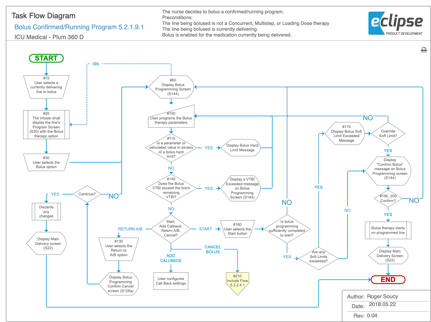
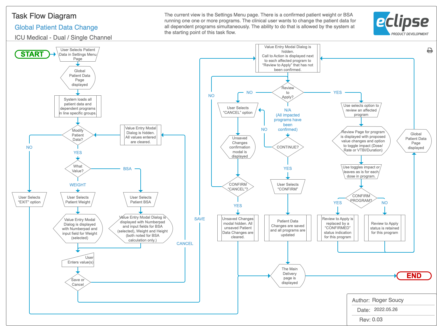
Task Flow Diagrams
As part of Research and Analysis portion of the Discovery phase, I created task flow diagrams to help lay the groundwork for the new platform.
By validating system-level requirements and existing use cases, I could identify where new features might fit within established workflows or if new workflows would be required. This also revealed opportunities to streamline existing tasks and improve usability without disrupting familiar patterns. The task flow diagrams then captured every interaction, decision point, and system response—including error handling. Through iteration, these flows evolved into a shared blueprint that aligned design and development of system logic and state machines resulting in faster implementation in production environments.
Concepts
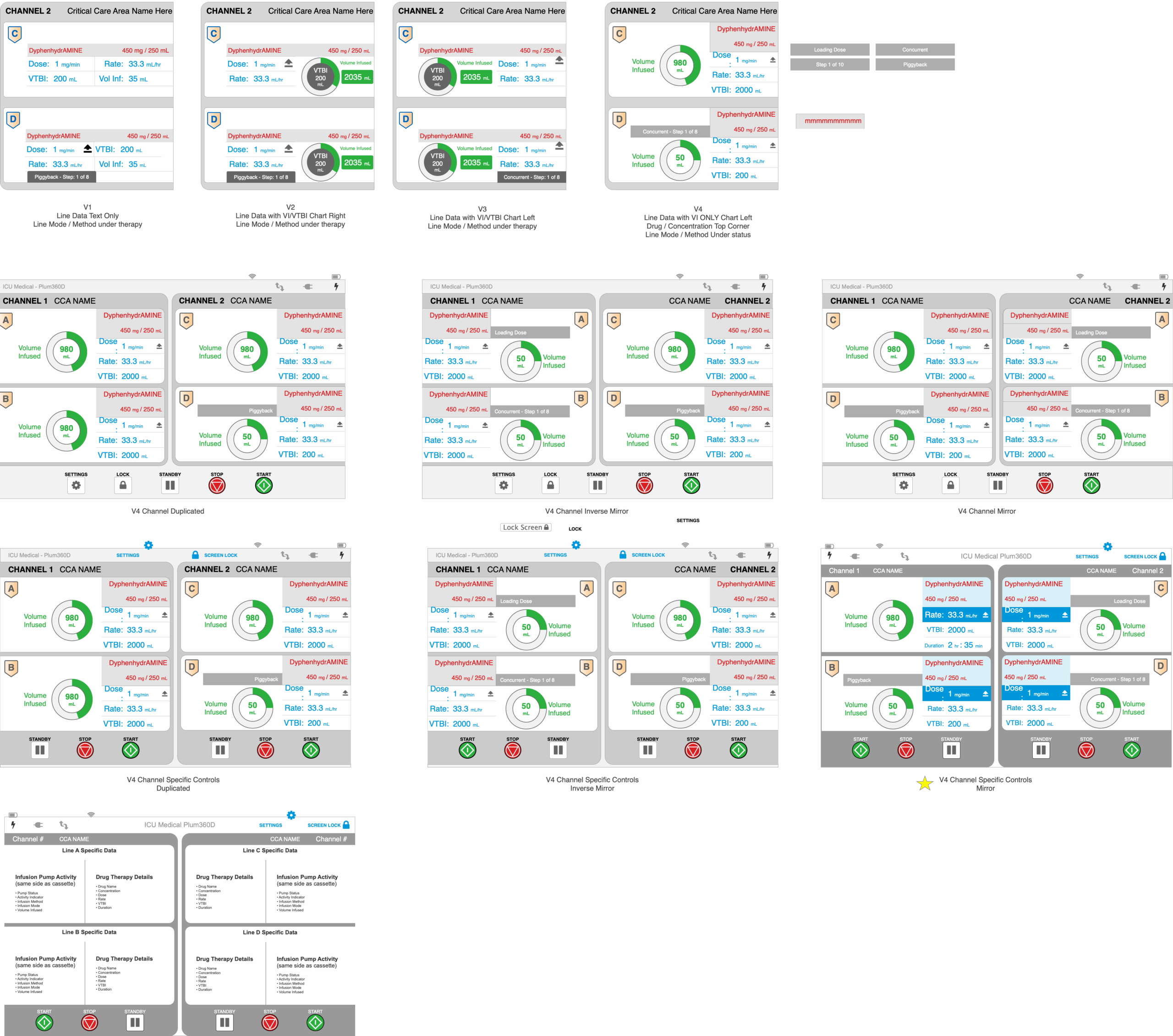
Following the ANSI/AAMI HE75 standard, touch-target and typography sizing was derived based off of the display’s PPI so that they would render at desired physical dimensions for proper interaction and readability. Using those as base-level constraints, I then calculated a grid for the UI components to adhere to. Late stage feature additions and/or revisions to requirements sometimes could not adhere to the grid, but the best effort was made to find an acceptable balance between change requests, UI constraints, and UX outcomes.
Once the content areas were defined, effort was placed on creating the UI content itself. Various concepts were created, evaluated and iterated upon to arrive at the final design. Throughout the process, design evolution reflected the changes in content prioritization, feature additions and changes, and changes in stakeholder visual preferences. Many concepts were prototyped to interactively demonstrate interaction models and system visual feedback.
Wireframes
Once concepts were approved, they were brought down to a low-fidelity, gray-scale variant that sanitized them of color, text values and other conditional attributes. This allowed the wireframes’ UI images to scale over time without requiring updates if a color or label changed.
The design leveraged common components, sometimes called ‘masters’, for reuse and consistency in the design. This permitted global behavior to be defined at that level and any instance of a common component would possibly include instance-specific behavior in addition.
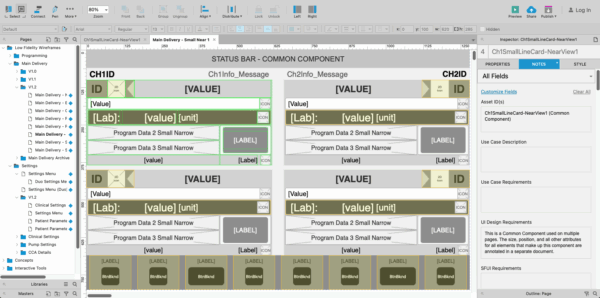
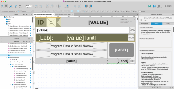
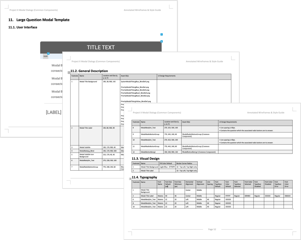
All attributes were annotated using footnote ID numbers that corresponded to callouts on the UI image. The annotations were broken up into separate tables: General Description, Visual Design, and Typography.
Initial wireframes also defined valid & default values, conditional logic states, and more. Essentially, the ‘when’ and ‘why’. However, a single source of truth for developers was needed and those details were moved out of wireframes to system-level requirements. This made iterative changes easier to maintain for the project.
Interactive Prototype
Interactive prototypes were created for multiple reasons. First, as a tool to help convey concept design intent for a shared understanding and informed decision making. Secondly as another tool that product owners and content creators could use to test text strings and labels for proper fit while maintaining compliant size for desired distance readability. And lastly, based of wireframes for usability testing. These prototypes were very functional but dynamically populated values, conditions, and limitations sourced from data tables based on cumulative decisions made by the user.
Usability Testing
I helped create the protocol and moderator guide for several rounds of testing. As an observer of the testing, I captured my observations and helped determine the cause of any usability issues revealed as well as provide insight as to various methods that could be employed to resolve them.
You must be logged in to post a comment.